CYCLE HAPPY
Cycle Happy is a tour-building tool designed to improve the cycling experience. It simply gives riders the scoop on the best places to ride and visit, then helps them on their way.


Project
I conceived of and developed this project as a learning tool for a UX design class at Bitmaker in late 2016. Its direction and iterations were influenced by feedback from my instructors and peers.
Initially, my aim was to decrease time spent way-finding and increase time spent bike riding.

thinking
I do a lot of bicycling while I’m on holiday. The thing I always want to know is “Where do the locals ride?” Cycle Happy was born of this question, but its shape and functionality was influenced by user feedback, testing and design thinking.
To help cyclists get out and bike, a primary driver for the design is to maintain simplicity making the research and route planning process minimal and quick.
UX RESEARCH
Intro
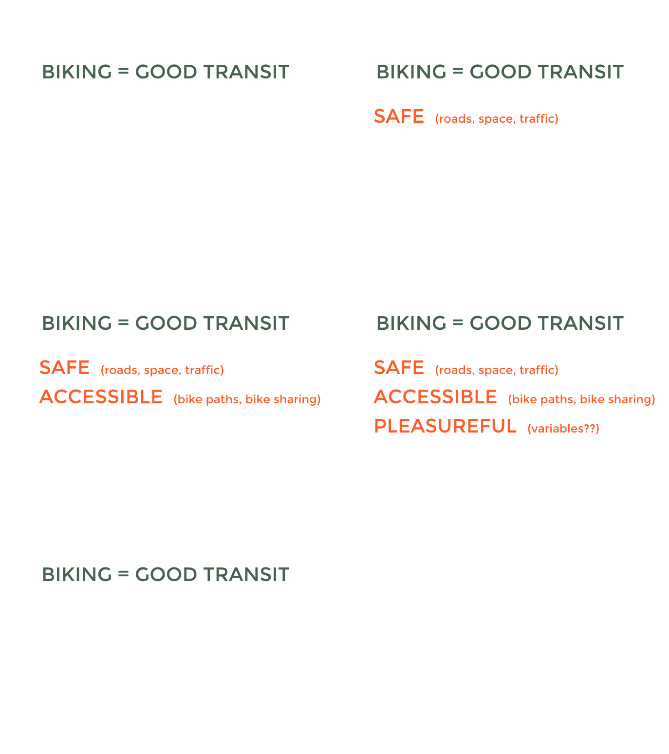
Bicycling is a good mode of transportation only WHEN:
- The roads are safe, there is ample space for bikes on the road and the traffic isn’t overwhelming for cyclists.
- There is accessibility to bike paths and public bike sharing
- The experience is pleasureful (this means different things to different people) but; if you don’t enjoy it you don’t do it.
An app can’t change a city’s infrastructure for safety or accessibility. It can, however, target pleasure.
How do you make cycling better?
by ⇧ pleasure

Uncovering the story
Through conversational interviews with many different kinds of cyclists, I found the following pain-points came up frequently:
- Riders find the frequent stops required to find yourself on the map or decipher a route to be arduous and tiring
- Google Maps for bike routes is found to be consistently misleading and inaccurate
- Riders feel frustrated knowing that they are likely missing great places they could be biking

Key Insights
I distilled out the following overarching needs from the interviews:
- Where: I found that riding on bike friendly routes is a very high priority for most riders.
- What: I learned that most cyclists choose to cycle so that they can connect with their surroundings.
- How: Most cyclists don’t do research before going on a ride, or don’t want to.
By mapping out my customer’s journey and iterating on the potential user flow, the purpose and plan for the tool started to take shape.
findings
Goal: to get riders out on their bikes quickly, with fewer stops and No frustrations
Don’t ask questions, just provide users with these answers:
- BIKE ROUTES: Curated, tried and tested bikes routes that a user can select and add to their tour.
- CITY SIGHTS: Curated places to go and bike friendly things to do in the city. Users can choose sights as a destination or a stop along their tour.
- BIKE SHARE: Both cyclists with or without a bike identified the same needs and complaints. When selected, the bike sharing option integrates a city’s public bike share network into the tour building process.

Design Process

Approach
With pen and paper I thrashed out all kinds of ways to break down the functionality of bike way-finding in a city. A system to isolate bike routes from city sights and public bike sharing came up in almost every solution.
Wireframes and Sketches
I mapped out three complete wireframes of increasing fidelity. In spending so much intimate time with the framework, I gained familiarity and perspective for the content and information hierarchy.
With user testing and feedback, the app changed dramatically with every wireframe.
Wireframe 1 started out as a half-visual mapping tool, half-text based menu. The second half, was mostly bloated with insignificant information.
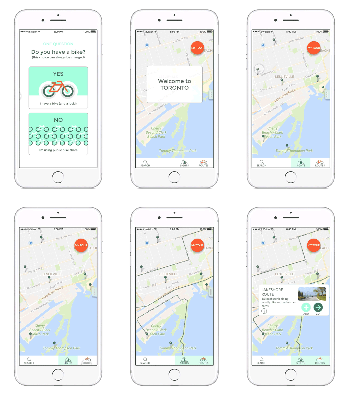
Wireframe 3 uses the map and graphical information in place of all the text based menus.


Tour Builder Feature
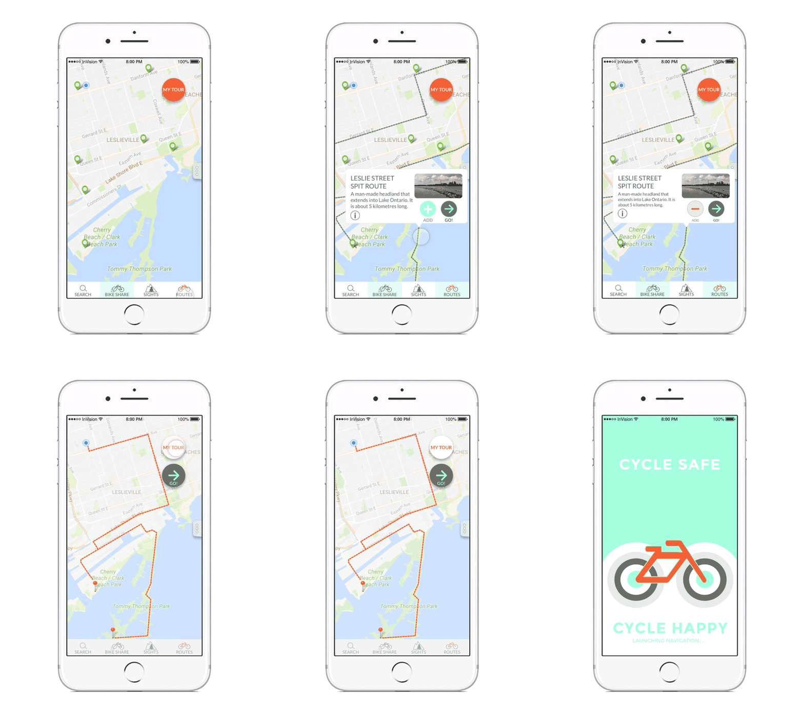
- As the user browses the city for points of interest, they have an option to ADD routes and sights to their tour.
- The Tour builder compiles the selections into a bike-friendly route that makes all the desired stops.
- By toggling in and out of the Tour builder users can manage their selections quickly and easily.
Route Navigation
An important part of the app is the navigational tool. Cyclists shouldn’t be looking at or holding a mobile device while they’re on the road.
Ideally the tour-guiding would be audio or tactile, in nature. A small speaker clipped to your helmet or a device, like a watch, on your skin using signals to guide your upcoming turns.
Although I haven’t explored this aspect, it’s something I’ve considered.

Visual Design

Creative
I gleaned some thematic consistency in creating the personas:
- Cyclists are positive, casual and independent.
- Exercise isn’t necessarily the goal, but is a high priority for all riders.
The mood board is punchy and energetic, but I chose to tone down the colour scheme a bit.
* In retrospect, not including the visual element of a map was a big oversight at this stage. I had to deal with this hurdle during the interface design.
Graphic
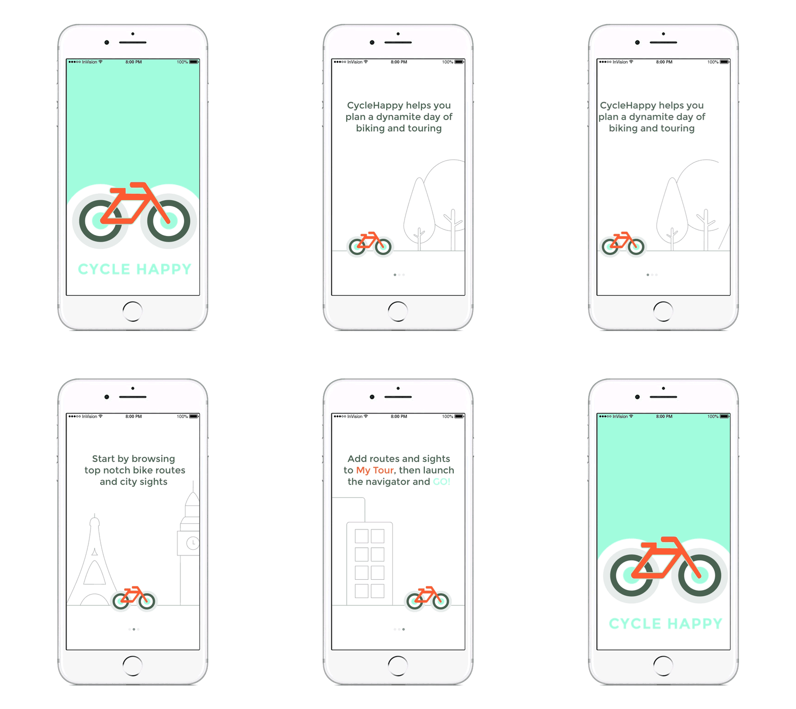
The app’s colour scheme and imagery is designed to reflect the verve from my interviews.
The Cycle Happy logo identifies a bike on a bright blue-sky day with energy vibrating and radiating from its wheels.

Assessment
I found the UX process oddly familiar, and I can only explain it as having an understanding for craftsmanship.
The UX approach includes the same due diligence and careful thinking that I apply in my current profession.
I don’t, though, mistake my enthusiasm and familiarity for experience. I learned so much during this project that it’s clear how much learning I still have to do. Having eagerness to continue this learning is my biggest win.
The Cycle Happy app remains just an idea, its greatest success is as a learning tool.
All images and content © 2017 Sally McCubbin


